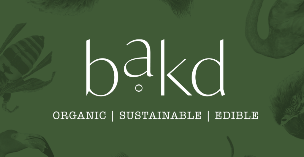
Bakd is a cannabis infused edibles line based out of Michigan. They make cookies and gummies in unique flavors using 100% organic ingredients.
Project Needs:
- Logo Design
- Gummies Package Design
- Infused Drink Package Design
The Preparation: Learning the Target Audience
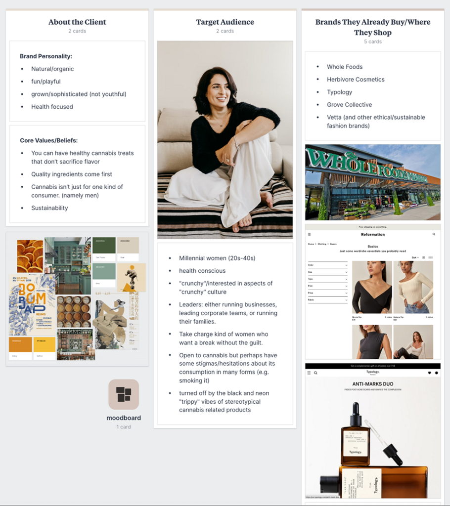
Before starting any branding project, we always do extensive research to nail down the client’s target audience. This allows us to design with them top of mind – creating an end-product that appeals specifically to them.
For Bakd, the target audience is women in their 20s-40s. They are incredibly health conscious and driven in their daily lives. These women tend to work in high-power, demanding jobs and want a break without all the guilt. They are open to cannabis products but are completely turned off by the stereotypical cannabis branding (blacks, neons, “trippy” vibes). They want something that feels elevated and feminine.
The Moodboard: Setting the Stage for the Project
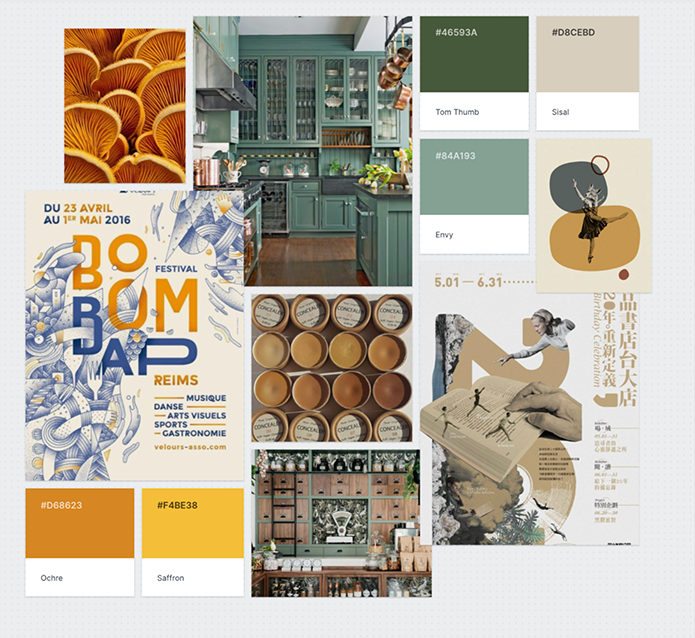
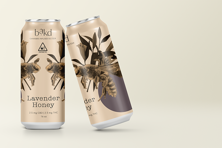
After nailing down the target audience, we were able to get straight to work mapping out the direction of the project. We pulled inspiration from other brands the target audience is already buying from, with the goal of creating as little friction as possible when the products hit the shelves. We chose soft, natural colors and serif fonts that help the organic products feel more like a health food, than a traditional cannabis consumable.
The Deliverables: Logo and Package Design
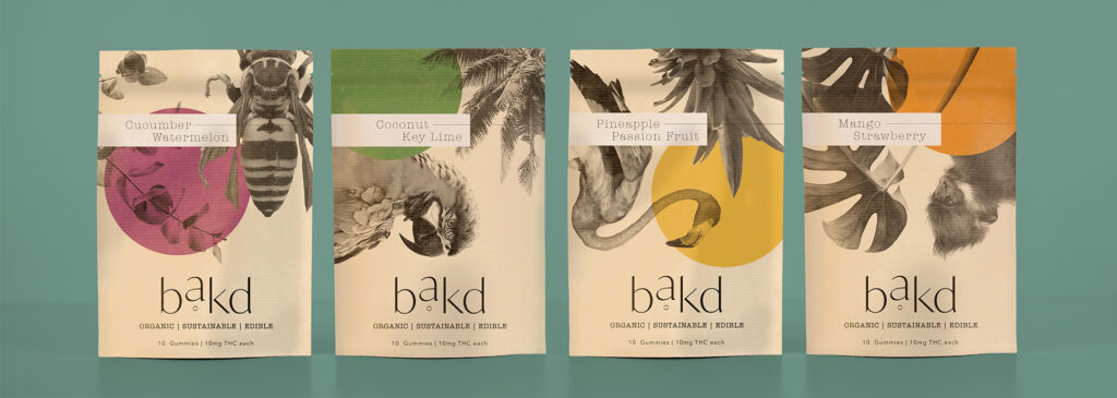
For the package design, we wanted something that was going to stand out on the shelf. We also still wanted to lean into the “organic,” “natural” feel of the brand which is why we chose to go with a Kraft colored package for the gummies. We used collage elements to bring a whimsical feel to the brand without being too overwhelming. This same theme was carried out through all of the product package designs.
Thinking a rebrand might be in your future?
Check out our Brand Development Partnerships to get started. You can also Book a brand consultation with me. During that time we will spend 45-60 minutes deep diving into your current business and brand to pinpoint what’s working and what’s not. You can get your questions answered and leave with a write-up that you can use to guide your brand development moving forward. If you choose to book a branding package with me after your consultation, the fee will be applied to your total package cost.
comments +