


Explore How Professional Branding Transformed a Small-Town Bagel Shop Into Champaign’s Must-Visit Destination
A case study in strategic rebranding for LGBTQ+ entrepreneurs
Hey business owners! Today I’m sharing one of my favorite client rebranding success stories that perfectly demonstrates why investing in professional branding isn’t just about looking pretty – it’s about creating a business that people can’t stop talking about.
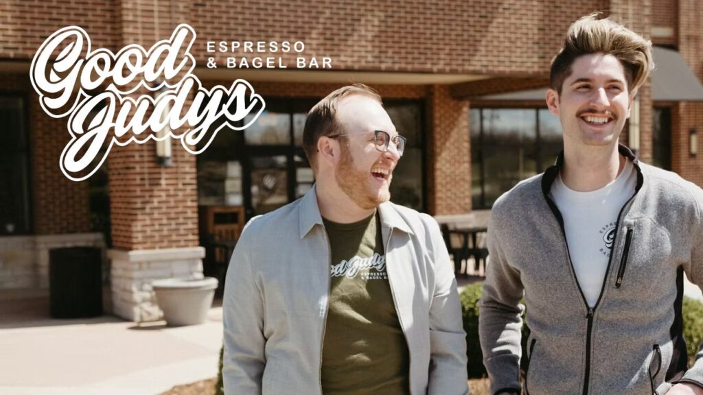
Meet Good Judys: The Bagel Shop That Conquered Champaign-Urbana
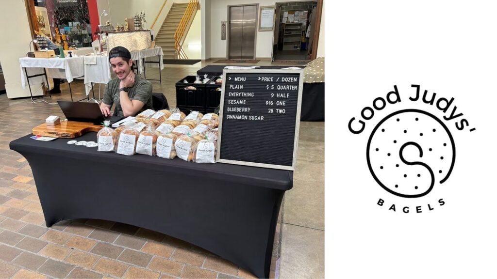
Picture this: It’s January 2024, and co-owners Dakota and Jeff are hustling at local farmers markets in Champaign, Illinois, selling bagels with DIY branding they’d pulled together themselves. Fast forward to September – they’re opening their first brick-and-mortar location and facing a challenge that keeps most small business owners up at night.
They were the new kids on the block in a town dominated by established coffee and bagel competitors, and their location was slightly off the beaten path. Plus, being fresh in their entrepreneurial journey meant they needed to establish credibility fast.
Sound familiar? If you’ve ever felt like the underdog in your market, this story is for you.
The Challenge: Standing Out in a Crowded Market
Here’s what Dakota and Jeff were up against:
The Competition Factor: Bigger, more established coffee shops had already claimed their territory in Champaign. These weren’t just any competitors – they had years of customer loyalty and prime locations.
The Location Challenge: Their new spot wasn’t exactly in the heart of downtown foot traffic. They needed something compelling enough to make people go out of their way.
The Credibility Gap: Being new meant they had to work twice as hard to prove they belonged in the local food scene.
The Goal: More Than Just a Name
Dakota and Jeff had a clear vision. They didn’t just want Good Judys to be another coffee shop – they wanted it to be an experience. Whether someone walked into their physical store, stopped by their farmers market booth, or browsed their website, they wanted that person to feel something special.
The brand needed to work hard enough to draw people to that slightly out-of-the-way location and make them glad they made the trip.
The Strategy: Targeted Authenticity
Here’s where things get interesting. Instead of trying to appeal to everyone (classic small business mistake!), we identified two key audiences:
- Local families and businesses in surrounding neighborhoods who needed a go-to coffee spot
- Graduate students looking for a welcoming off-campus hangout
Our approach? Create branding with enough sophistication to feel premium while maintaining the warmth and approachability that makes a coffee shop feel like home.
The Branding Process: From Discovery to Design Magic
Discovery Phase: Getting to the Heart of Good Judys
We kicked off with a two-hour deep dive that covered everything – target audiences, buying behaviors, competitive landscape, and current marketing efforts. This wasn’t just a pretty design project; this was strategic brand building.
Direction: Retro Chic with a Story
The inspiration board Dakota and Jeff created told us everything we needed to know. They were drawn to retro and vintage aesthetics, which perfectly aligned with their Judy Garland backstory (yes, that’s where “Good Judys” comes from!).
The goal wasn’t to feel outdated but to capture that retro chic vibe that would make their ideal clients think, “This is the cool spot.”
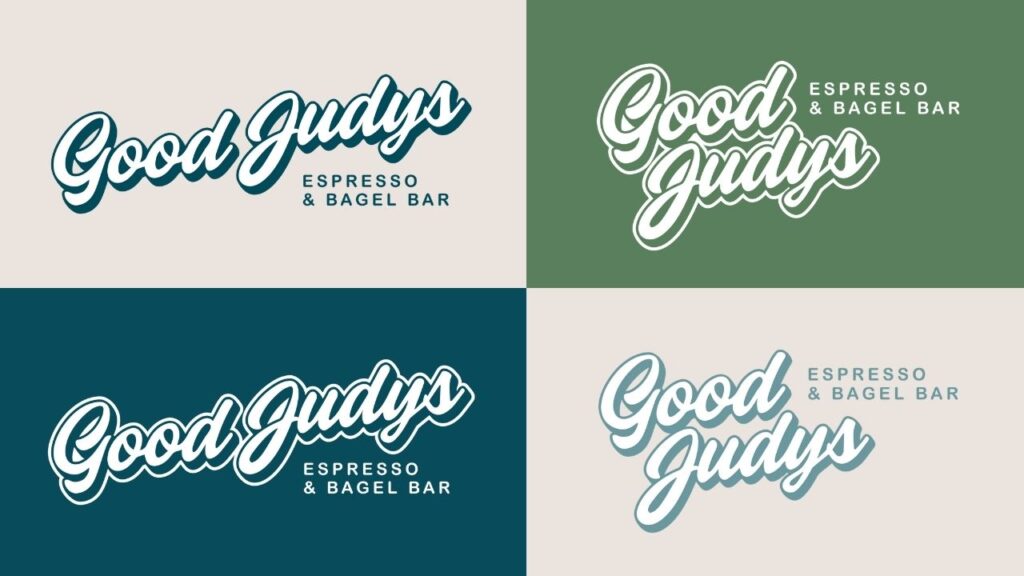
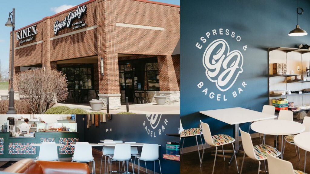
Design: Midcentury Modern Meets Bagel Shop Charm
Color Palette: We went full midcentury modern with sophisticated hues anchored by that signature “yellow brick road” color – a perfect nod to their Wizard of Oz inspiration.
Typography: We paired the midcentury aesthetic with fun, approachable restaurant menu-inspired fonts that immediately communicated “we’re in the food business.”
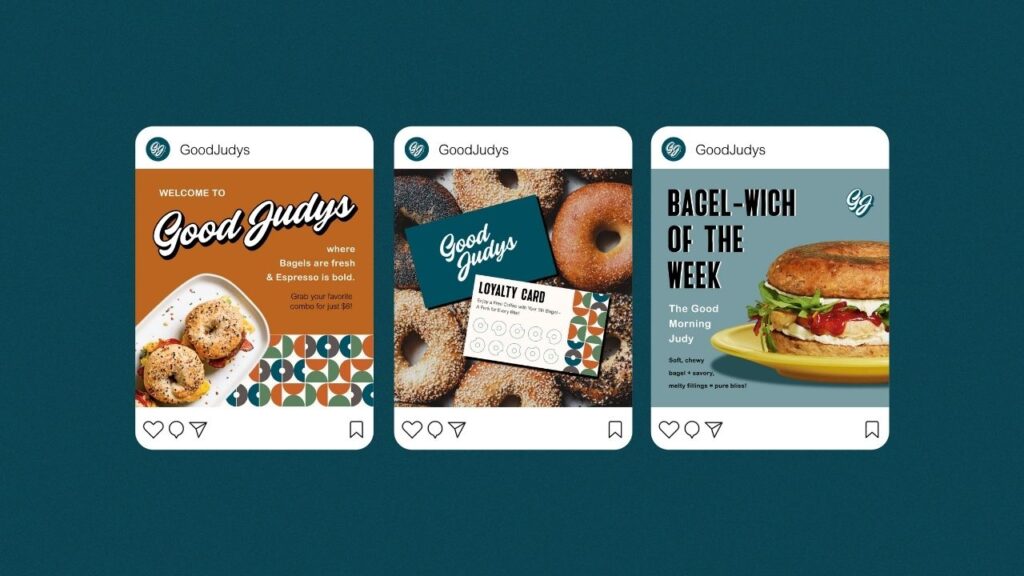
Brand Pattern: Custom bagel-inspired patterns that maintained the midcentury theme while being uniquely theirs.
Tagline: “There’s no place like Good Judys” – because when you’ve got Judy Garland inspiration, you lean into it!
Implementation: Bringing the Brand to Life
While Dakota and Jeff prepped their physical space, we were working behind the scenes to ensure every touchpoint reflected their new brand:
- Paint colors that matched their brand palette
- Custom wallpaper featuring their brand pattern for the main counter
- Branded stickers for to-go orders and packaging
- T-shirt designs that customers actually wanted to wear
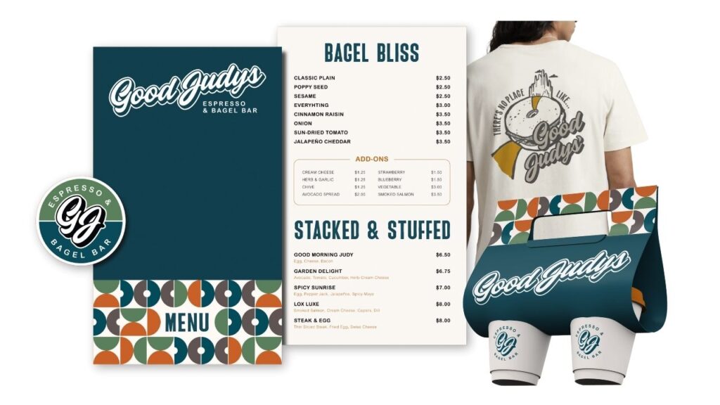
The Deliverables: A Complete Brand Toolkit
Here’s what Dakota and Jeff walked away with:
- Buyer Persona & Journey mapping
- Complete Logo Suite
- Color & Typography Palettes
- Comprehensive Brand Guidelines
- Custom Brand Pattern
- T-shirt Design
Everything they needed to maintain consistency across every customer touchpoint.
The Results: Beyond Their Wildest Dreams
Ready for the good stuff? Here’s what happened:
Grand Opening Success: They sold out of bagels by 10:30 AM on opening day. Not a typo – 10:30 AM!
Consistent Sellouts: They’ve sold out so frequently that they had to invest in signage to let customers know when bagels are still available.
Premium Perception: Multiple customers have asked if they’re a chain restaurant because everything looks so professional.
Industry Recognition: Named “Best New Food Business of 2024” by Champaign’s Smile Politely. And featured in a number of local publications and news outlets including The Daily Illini and WCIA 3 News.
Digital Growth: Increased website traffic and engagement across all channels.
What the Clients Are Saying
“We have definitely experienced increased engagement and website traffic. Many more people understand the brand and have a more positive association with it now.”
“We’ve had customers tell us that it looks like we are a chain. They say everything is so professional looking that they would have never guessed we were just a small business.”
“We feel like we have a consistent brand identity that is unique and sets us apart from our competitors. The consistency in what we can do now makes us feel a lot more professional with everything we do.”
The Bigger Picture: Why Branding Matters for Your Small Business
This isn’t just a feel-good story about a bagel shop (though it totally is that too!). This case study demonstrates several critical business principles:
Strategic Positioning Works: Instead of trying to compete on price or convenience, Good Judys differentiated through experience and brand story.
Consistency Builds Credibility: Professional, cohesive branding made customers perceive them as more established than they actually were.
Storytelling Sells: Connecting their brand to the Judy Garland narrative gave customers something to remember and share.
Investment Pays Off: The upfront investment in professional branding delivered measurable returns from day one.
Key Takeaways for Small Business Owners
- Know Your Audience: Don’t try to appeal to everyone. Good Judys succeeded by focusing on two specific customer groups.
- Embrace Your Story: Your brand’s origin story can be your biggest differentiator.
- Consistency is Everything: From paint colors to packaging, every touchpoint should reinforce your brand.
- Professional Doesn’t Mean Boring: You can be sophisticated and approachable at the same time.
- Location Challenges Can Be Overcome: Great branding can make people travel for your product.
Ready to Transform Your Small Business’ Branding?
Dakota and Jeff’s journey from farmers market vendors to award-winning business owners didn’t happen by accident. It happened because they invested in strategic branding that told their story, connected with their audience, and created an experience worth talking about.
If you’re ready to stop blending in and start standing out in your market, let’s talk about how professional branding can transform your business too.
Want to see how strategic branding could work for your business? Reach out for a free project consultation and let’s explore your possibilities.

comments +