


Bullard Auto Service is a woman-owned auto repair shop that was founded in 1970. Their mission is to provide high quality service from ASE Certified techs, assuring you and your family have safe, reliable transportation.
Target Audience
After going through my dream client questionnaire we realized the people we wanted to be appealing to were women in their mid-20s to early-40s who have started families. These women are often concerned about being price gauged and intimidated when they go to get their cars worked on.
Logos
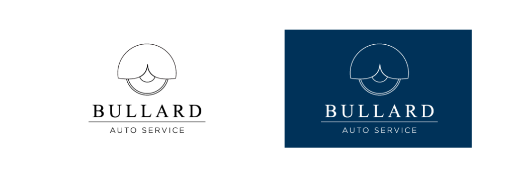
For the logo, we chose a serif font paired with a sans serif. The serif font used on “Bullard” adds a sophisticated feel that stands out from most of their competitors. Pairing it with the sans serif “Auto Service” ensures that it remains approachable.
We wanted to include the tire and fender as this is a recognizable symbol in the automotive industry. By choosing thinner lines and adding the wave that cuts into the middle of the fender, we were able to bring more femininity into the logo.
Color Palette
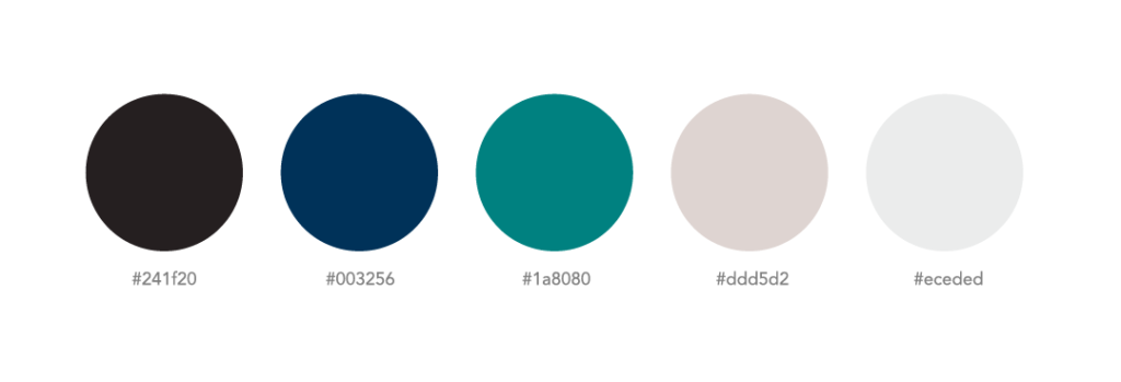
A majority of auto shops choose reds, blacks, whites, and royal blues for their brand colors. These tend to have a very masculine and sometimes sterile vibe to them. We wanted to avoid this but also remain recognizable so we chose to explore different kinds of blues. The owner mentioned that their clients would much rather be on vacation than getting their car worked on, so we drew inspiration from the ocean and chose a deep navy, a teal, and a warmer beige to compliment the two.

comments +