


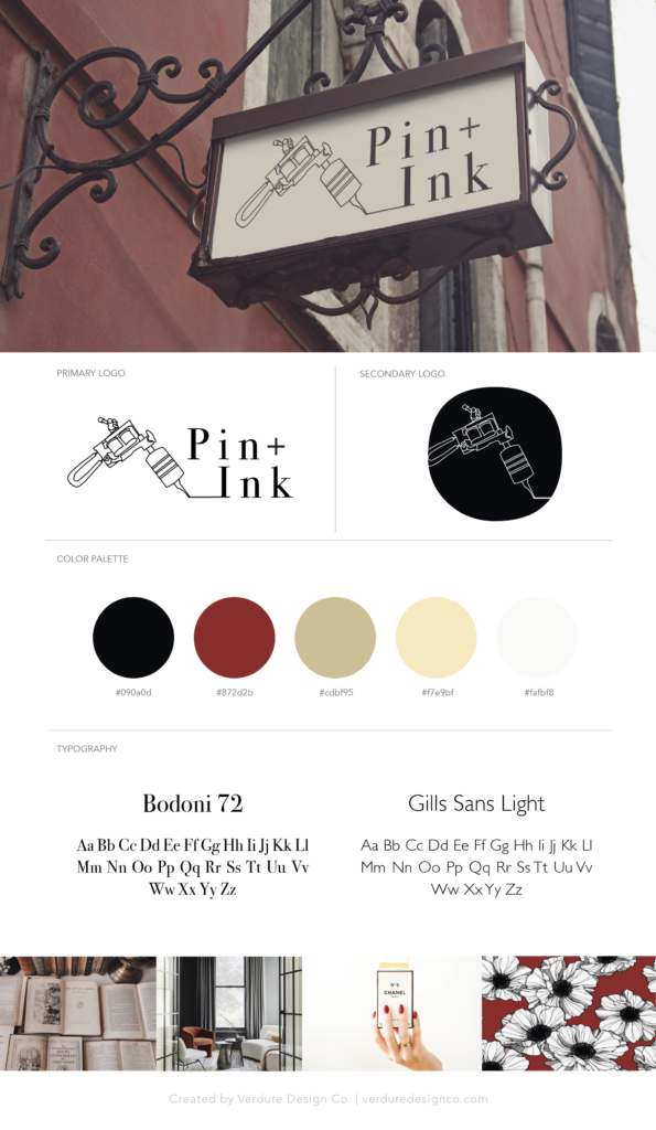
Pin and Ink is a woman-owned tattoo shop dedicated to making the tattoo experience inviting and inclusive. The goal with their branding was to develop a logo and accompanying brand guidelines that would appeal to women and challenge the idea of a “traditional” tattoo shop.
Target Audience
Pin and Ink’s main audience is women between the ages of 21 and 40 who have wanted to get tattoos but are intimidated or uncomfortable with traditional tattoo shops. These women have possibly scouted other tattoo artists but decided against booking an appointment upon visiting the parlors.
Logos
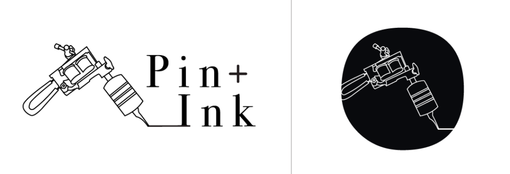
After realizing that most traditional tattoo shops have a very masculine, almost aggressive vibe to them, Pin and Ink wanted to flip the script. For their logo we chose a serif font and increased the kearning to give the letters more room to breath. This spacing gives the viewer’s eyes a chance to rest between the letters, creating a sense of calm. We wanted subtle touches of femininity so we added the simple plus sign in spot of the “and.” We also stacked the name which subconsciously registers as “Pink” at a glance, feeding into more femininity without having to use pinks or pastels in the color palette.
Color Palette
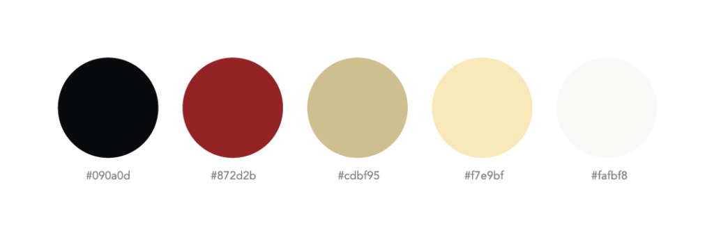
While Pin and Ink wanted to push the envelope on the “traditional” tattoo shop, we did choose to keep a standard red and black that is often associated with the business. We chose to pair it with softer creams that helped to elevate the traditional colors and bring in warmth and a softness that tends to be missing from other tattoo shops. Inspiration for these colors came from high-end makeup and perfume brands.

comments +