


WTFrites–pronounced “What the Frites”–is a food truck started by two skaters who saw a need for better snack food options at the skate parks they often frequented. They wanted to start a truck that had hearty munchies that were easy to chow down on in between drop-ins and boardslides.
The brand needed to be bold, creative, and punk. We didn’t just want it to be a one and done experience for the customers, but instead something that could blend in with the current skater culture. Additionally, while there weren’t many food trucks on the scene yet, the brand needed to be memorable as more and more trucks have begun to pop up all over the market.
For this project we developed:
- Brand Naming and Tagline Development
- Custom Brand Illustrations
- Brand Identity Design
- Food Truck Wrap
- Custom Branded SWAG/Merch
The Food Truck Brand Concept:
During the development process, we explored what other french fry businesses overseas were doing. Having experienced the frites in a cone while traveling abroad, the owners knew that was an element that would work well while on their boards. We also looked at what various skateboarding brands were doing. Since the goal was to create a food truck brand that could become part of the skater culture, we wanted to infuse elements that were already familiar to the audience. Things like: blacks paired with bright colors, graphic illustrations, and bold statements were all pieces that made their way into the final designs.
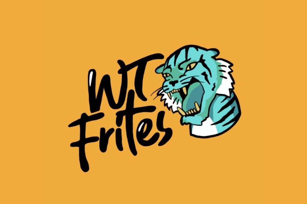
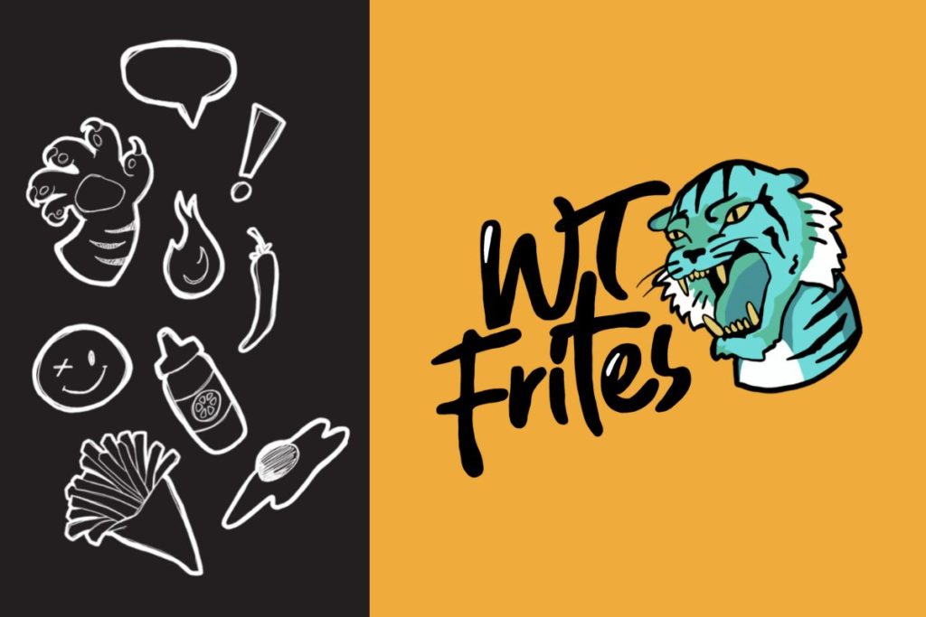
The Custom Illustrations:
We knew we wanted to develop a set of custom brand illustrations for WTFrites food truck. The illustrations wouldn’t just be used in the logo and on the trucks, but could be turned into stickers, patches, and other merchandise that could be sold or handed out at events.
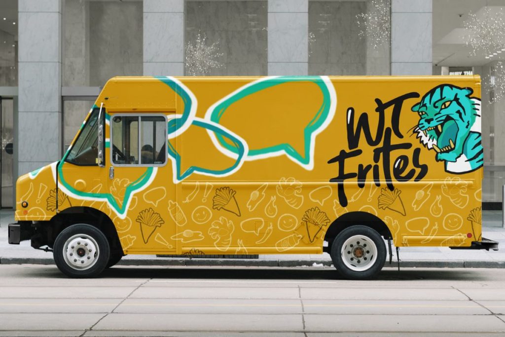
The Food Truck Wrap Design:
For the food truck wrap design, we created a pattern with the custom illustrations in order to push more consistency and create more opportunities for brand recognition. A majority of the food truck wrap design was yellow, a color that draws attention and stands out amongst the often dark/industrial elements of a skate park. We added pops of the blue and teals found in the brand’s logo to complement the large illustrated logo placed on the side of the truck.
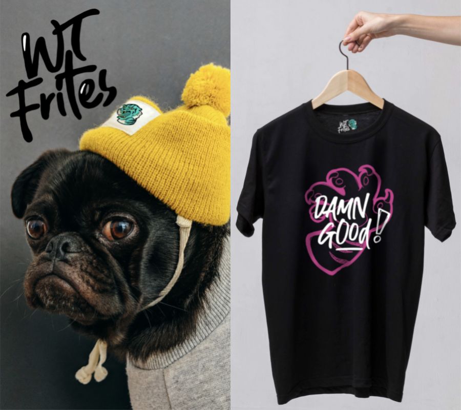
The SWAG and Merchandise Design:
Merchandise was another opportunity to turn this food truck into a memorable brand. We developed t-shirts and beanies that could be sported by the skaters at the park as well as stickers that could be placed on boards, helmets, and areas around the park. This merch is what really brought the brand to life and elevated it from a normal food truck brand to something worth talking about. Not only did the merch and SWAG give their customers something fun and different to connect with, it also provided an opportunity for fan-based advertisement when photos of their customers were shared on social media and when they attended other skate parks where the truck wasn’t present.
Have A Project You Want Help With?
This project was blast to work on and really tested our ability to combine marketing strategy with a bold and creative design. If you need help with your branding, check out our Brand Development Partnerships to get started. You can also Book a brand consultation with me. During that time we will spend 45-60 minutes deep diving into your current business and brand to pinpoint what’s working and what’s not. You can get your questions answered and leave with a write-up that you can use to guide your brand development moving forward. If you choose to book a branding package with me after your consultation, the fee will be applied to your total package cost.

comments +